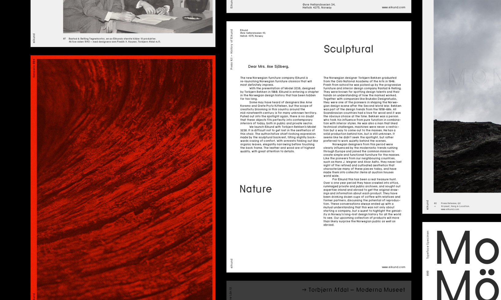
Sculptural Nature
Identity & Bespoke Typeface for Eikund, a furniture company re-launching Norwegian furniture classics. Transitioning Norwegian design icons into today's design scene, with an emphasis on craftsmanship and tradition.
Category→
Arts & Culture, Fashion & Luxury
Work→
Visual identity, type design
Awards→
European Design Awards, Visuelt
Client→
Eikund
Challenge
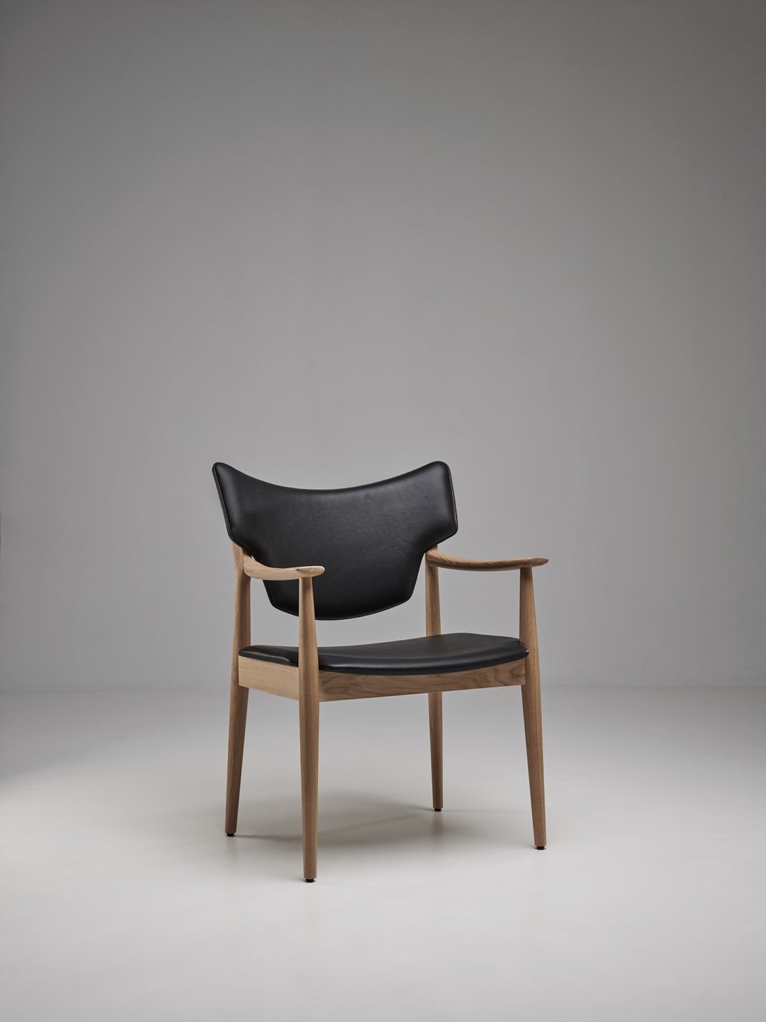
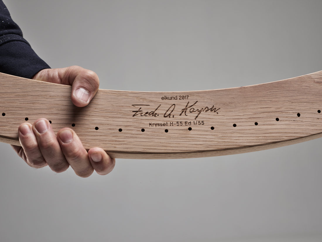
The challenge was to separate Eikund from the generic mass of furniture producers. Adding personality and an attitude that would communicate their product. For Eikund, the most important factor of success was to demonstrate what makes Norwegian craft unique and valuable – and being able to tell this story in all applications.
Solution
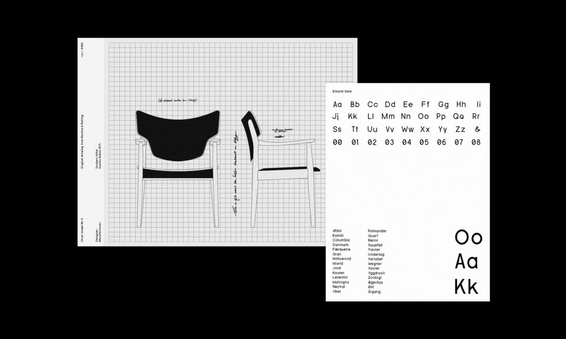
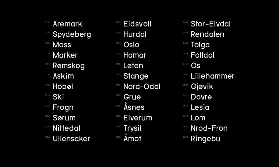
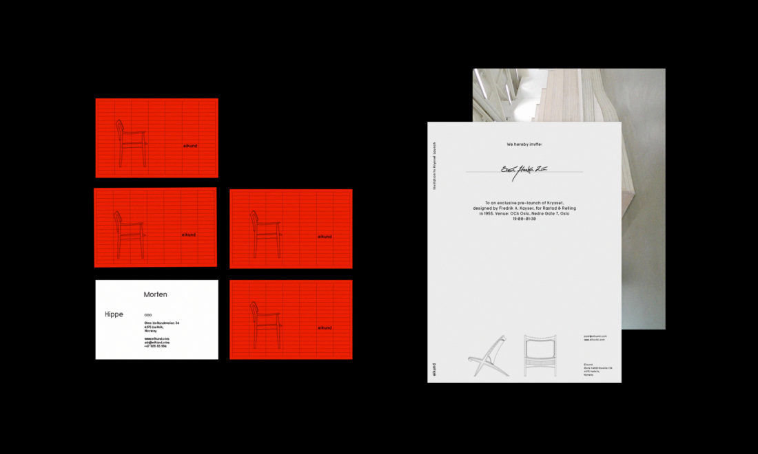
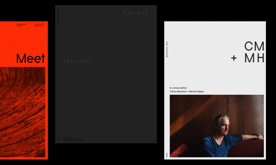
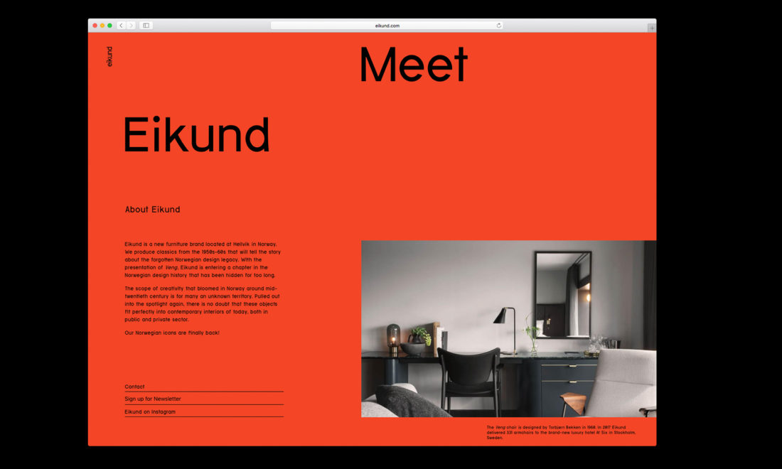
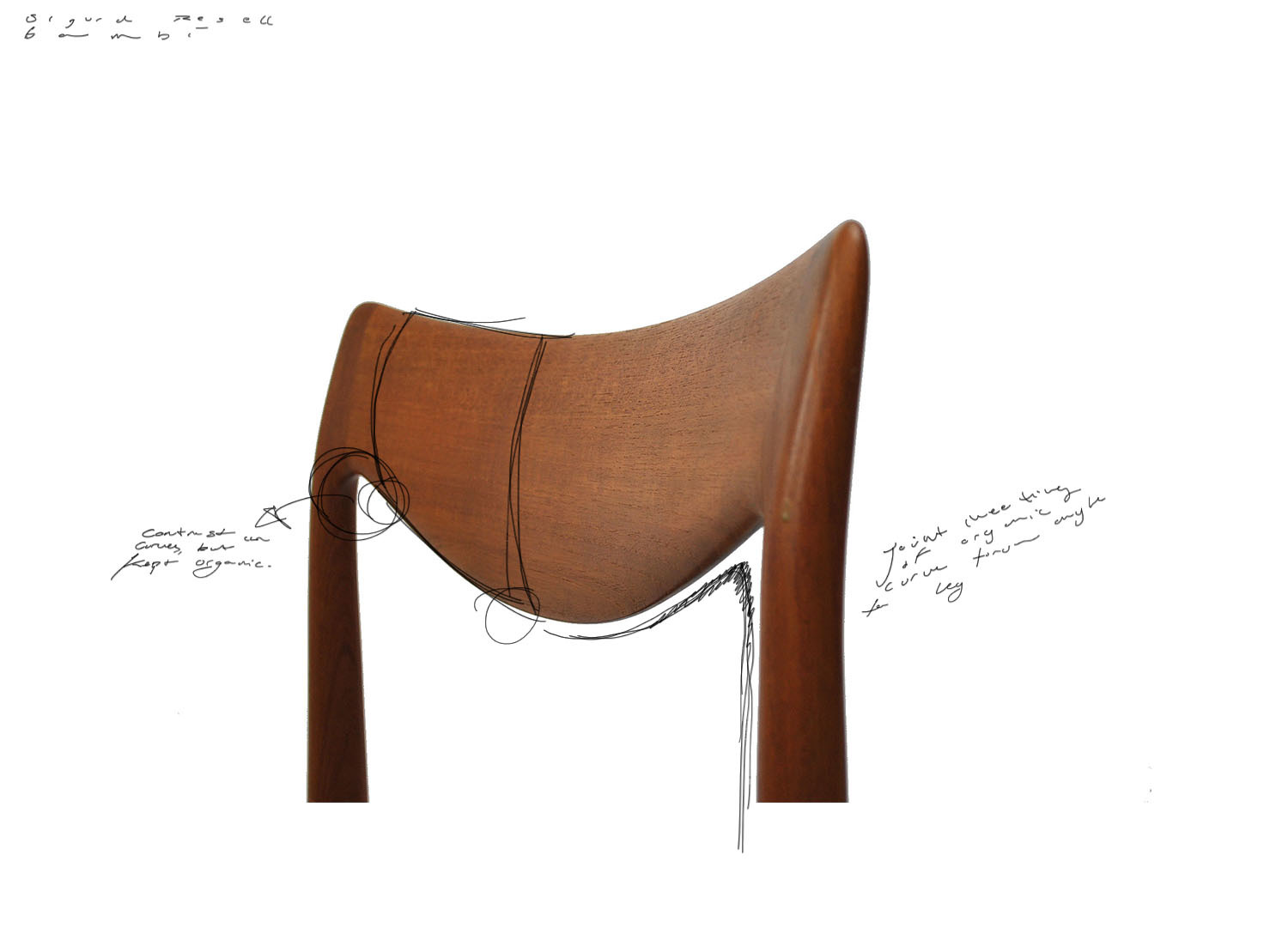
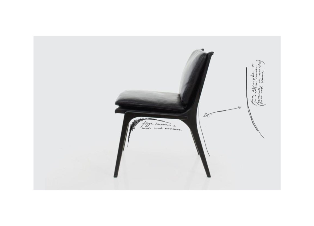
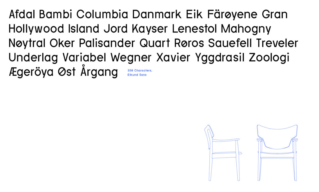
Eikunds identity evolves around their sculptural furniture. We wanted to tell the story of a naked aesthetic, both as a visual clue – but also as the narrative of Scandinavian design. The notion of nakedness, honesty and something pure. The main composites build up under the idea of a transition from historic to relevant. Fiery orange is applied to create a contrast to the natural materials of the product and to establish Eikund as an innovator in their segment. We developed a custom typeface, constructed with shapes from their furniture. It's a Neo-Grotesque sans-serif, with a neutral appearance but specked with details and contextual alternates, as a natural extension of the furniture.
Result
As a result, Eikund received a distinct expression to establish a new voice in an already crowded market. Backed by solid storytelling and physical resemblance the typeface and identity play its role, and also serves as a contrast to the narrative of the humble Norwegian heritage, transitioned towards a global market.