As bold as one
ORF1 (former FS1) has been Austria´s number one TV channel since 1961. The mission of ORF 1 is simple: Broadcasting quality TV content for everyone. It was time for a new and confident take on a television identity based on new values and a clear vision. The main design principles are courage, clarity, versatility and zeitgeist.
Category→
Technology, Art & Culture
Work→
Visual identity, digital design, motion design, type design, strategy
Awards→
Red Dot Awards, Visuelt, European Design Awards
Client→
Österreichischer Rundfunk
Background
ORF 1 has been accompanying Austria for decades. Hardly any brand in Austria is more versatile than ORF 1. The channel offers span from humour, entertainment, series, information, live sports events, children program to movies and Hollywood blockbusters. The channel struggled to unify the vast content under one wholistic brand and needed a flexible design system which is both functional and emotional.
ORF 1's new channel identity is the result of a sharp positioning phase and a brand promise for the future: Confident, clear and modern.
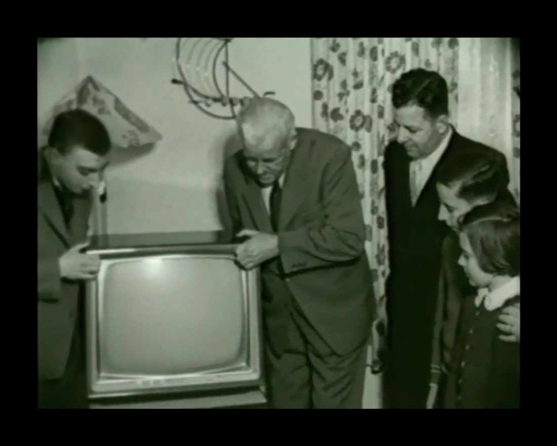
ORF started in Austria in 1955
In 1961 the ORF channel was split into as FS1 (now ORF1) and FS2.
We were looking for an identity that integrates into the overall ORF brand while strongly speaking for ORF 1. Bleed convinced us with their exciting solution that stood out of an international competition with many good contributors.
— Lisa Totzauer, Channel manager @ORF1
Approach
The biggest challenge – but also chances – for ORF 1 lie in the diversity of the program. This applies especially to the on-air design, but also on all other channels. The new design reflects precisely this diversity and offers orientation: the strong new 1-symbol, bespoke typeface and the animation concept provide the solid core of the identity. An elaborated colour concept makes the extensive program offer more visible and provides a recognition feature for the audience.
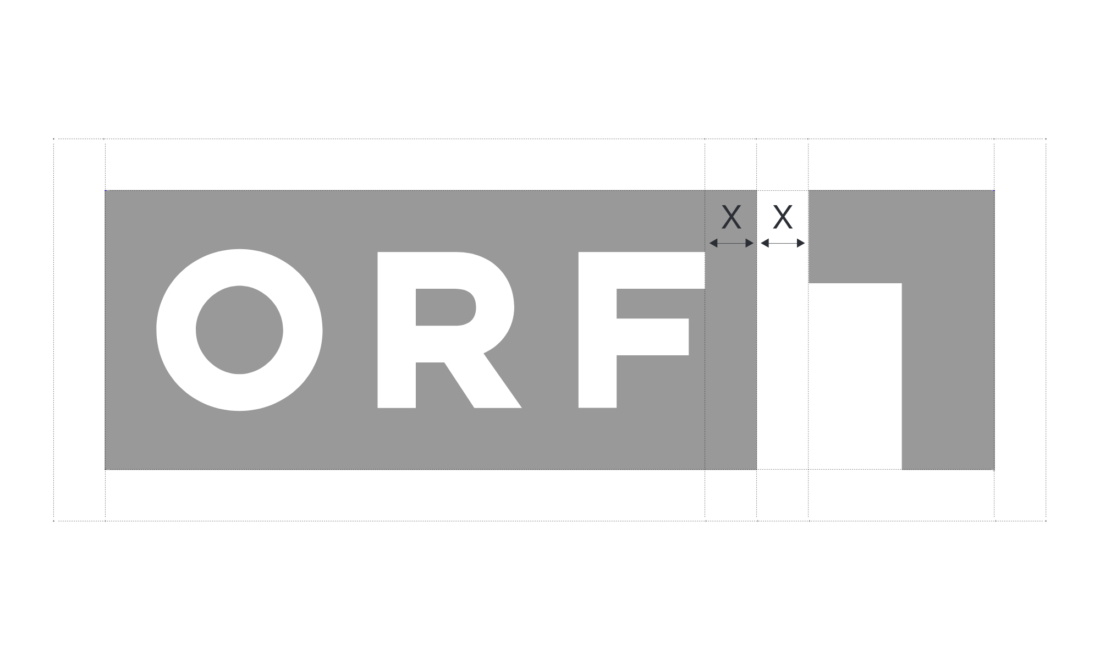
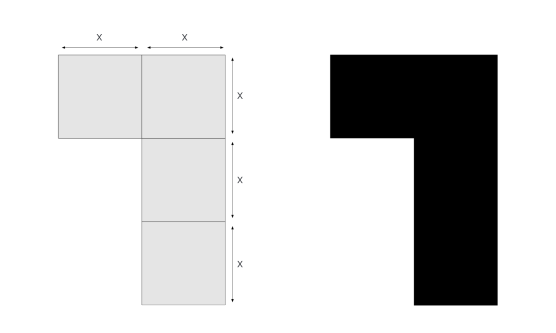
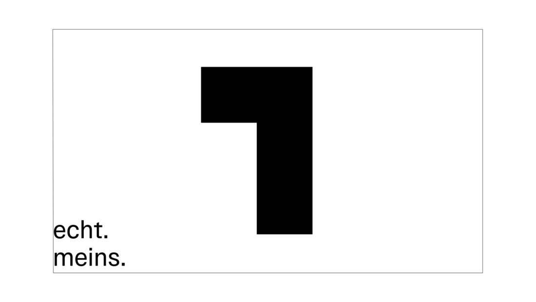
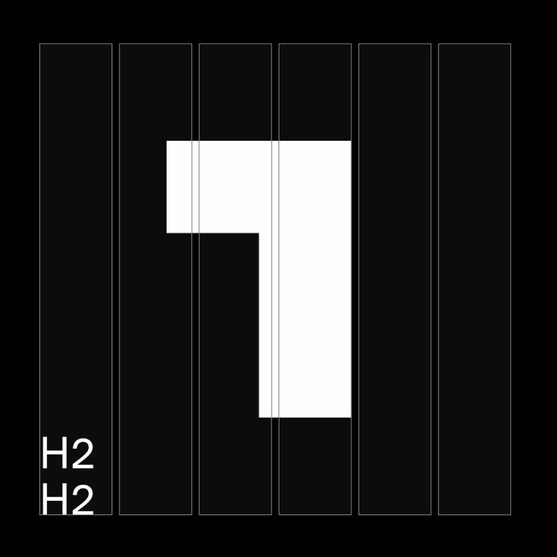
Symbol and logo build-up.
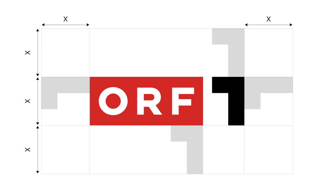
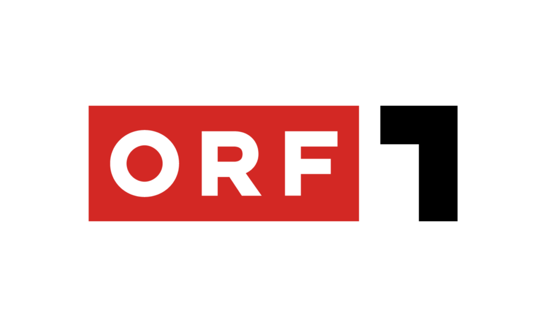
The one
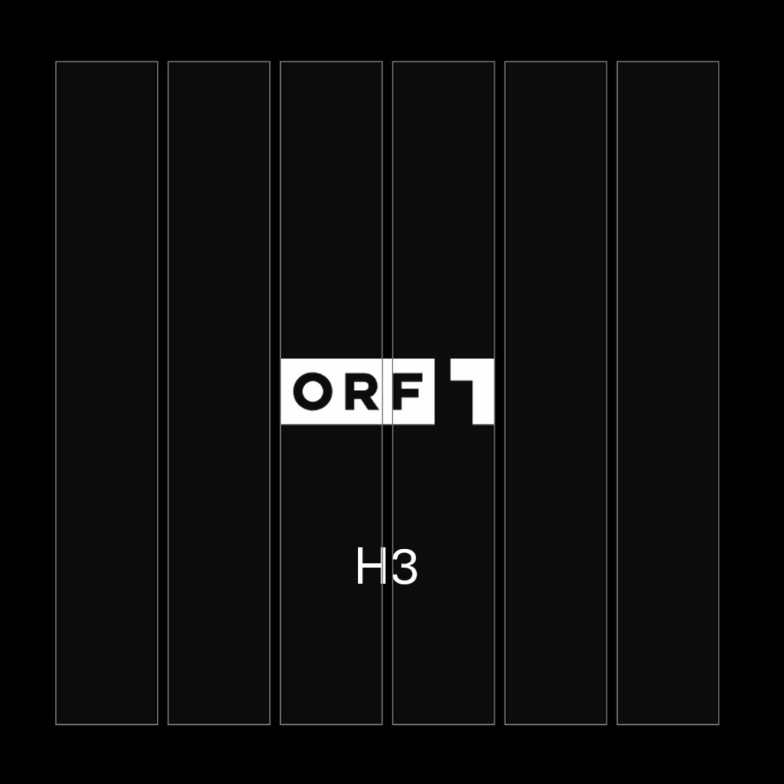
A radical change on the logo was the major step to expressing the brands brave and straightforward mindset. The number 1 is the channel’s new symbol. It is clear, concise and confident. It has an architectural approach and is constructed of 4 simply stacked squares. It completes the iconic ORF-brick in the logo but also works independently as strong and uncompromising key visual.
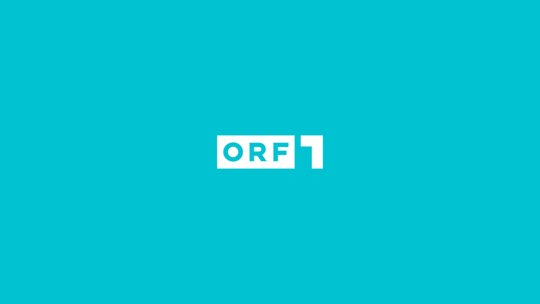
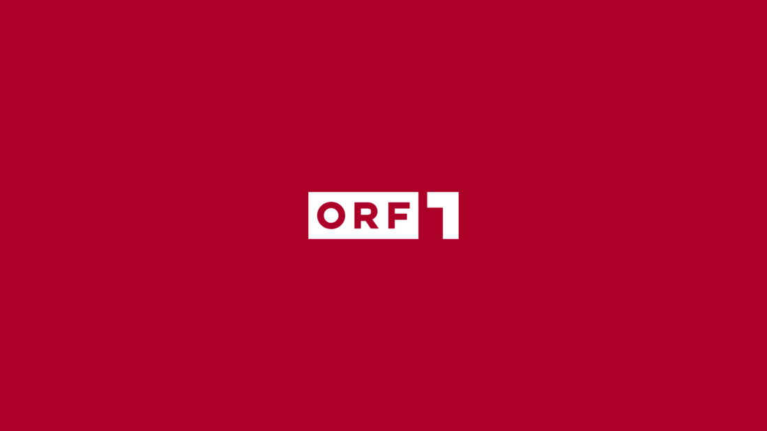
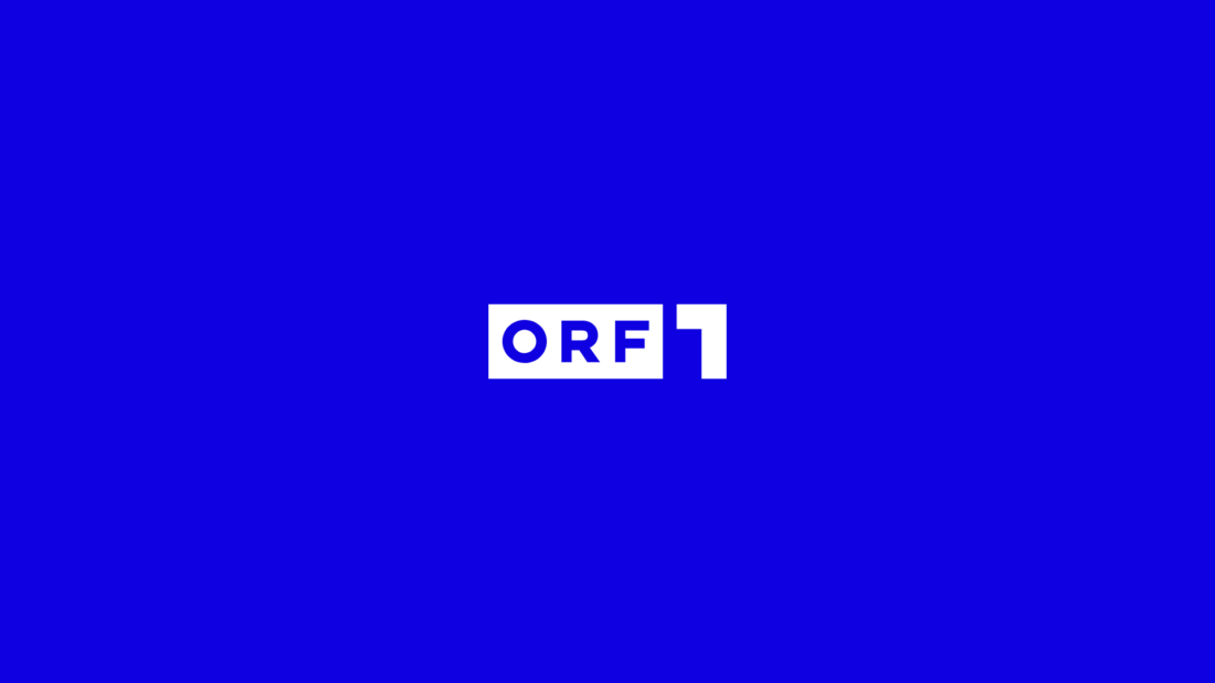
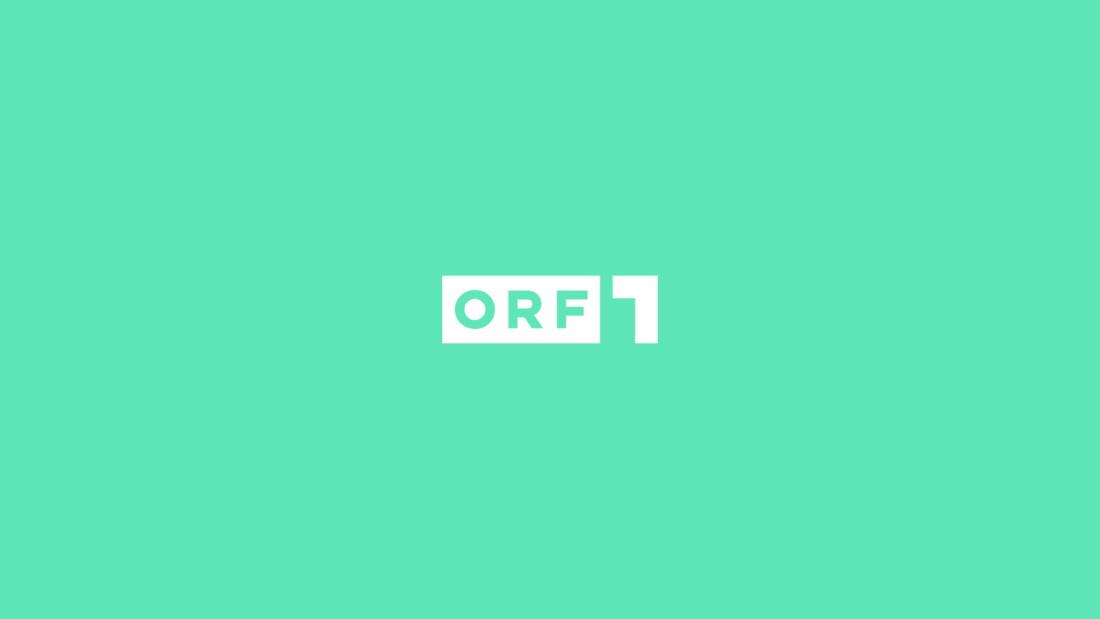
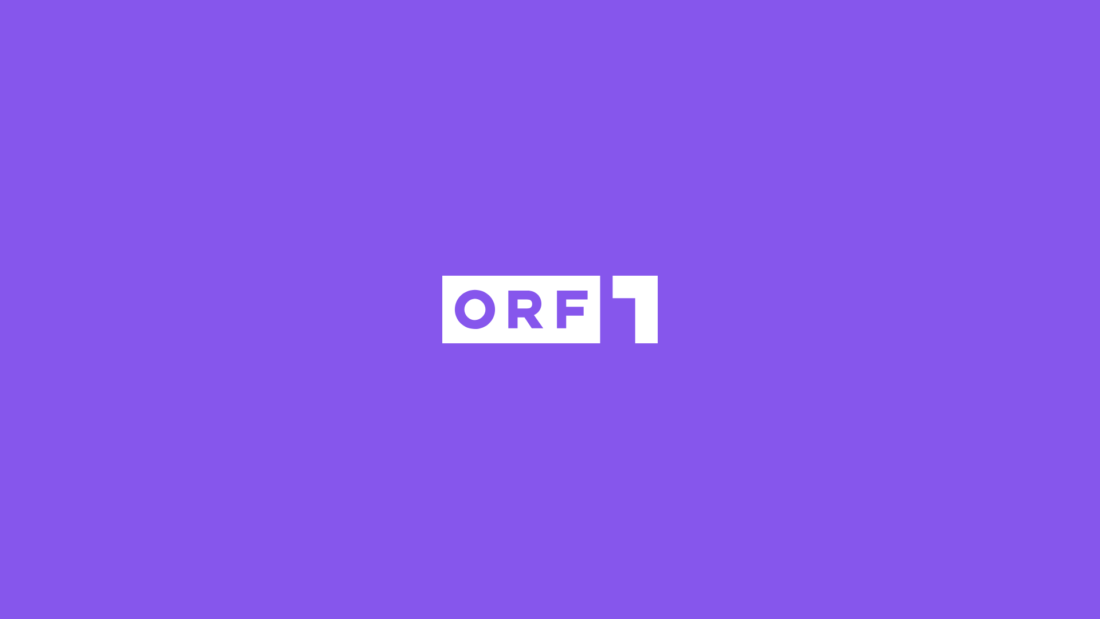
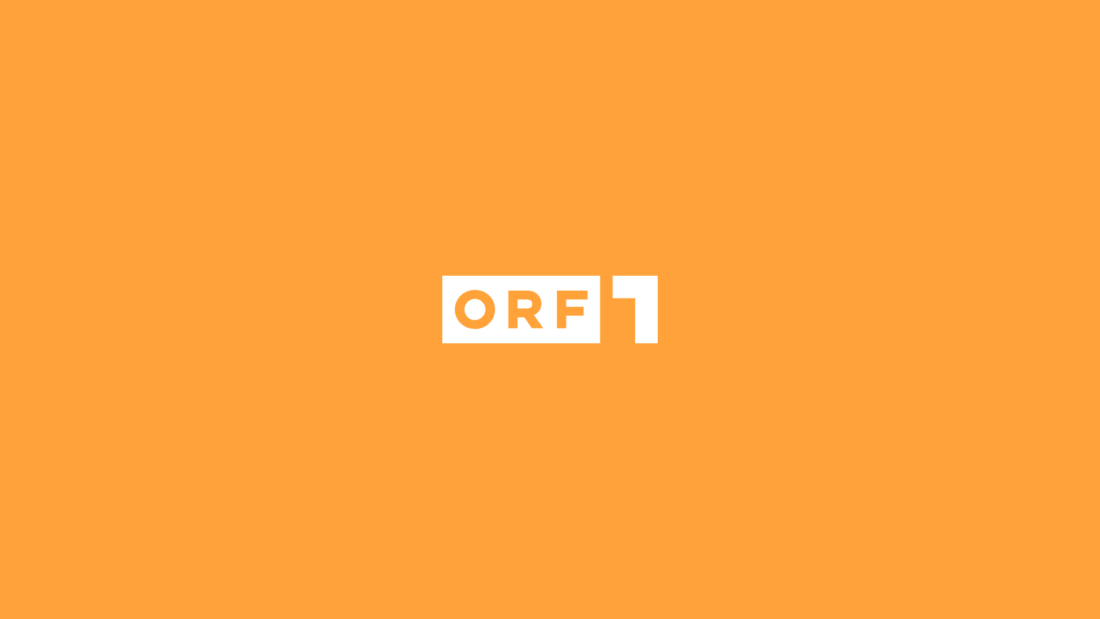
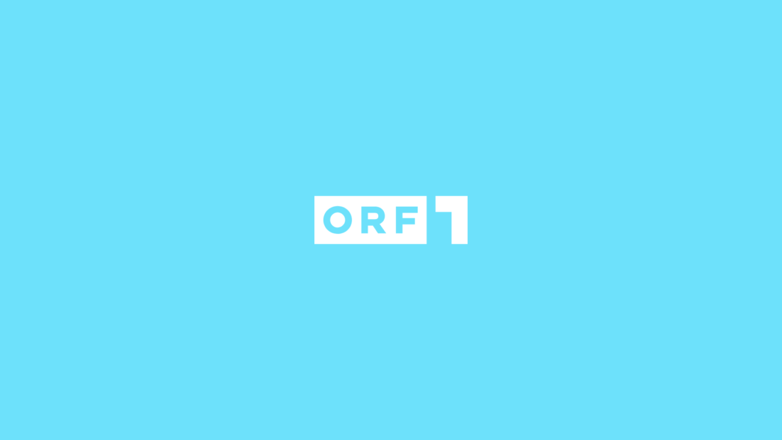
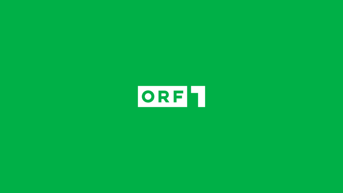
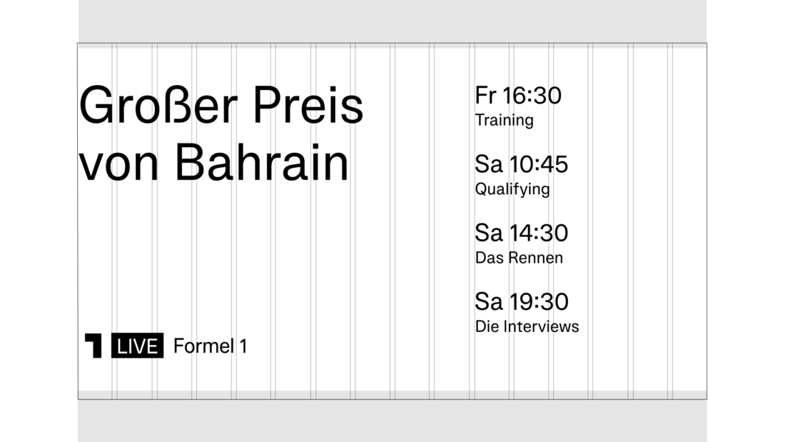
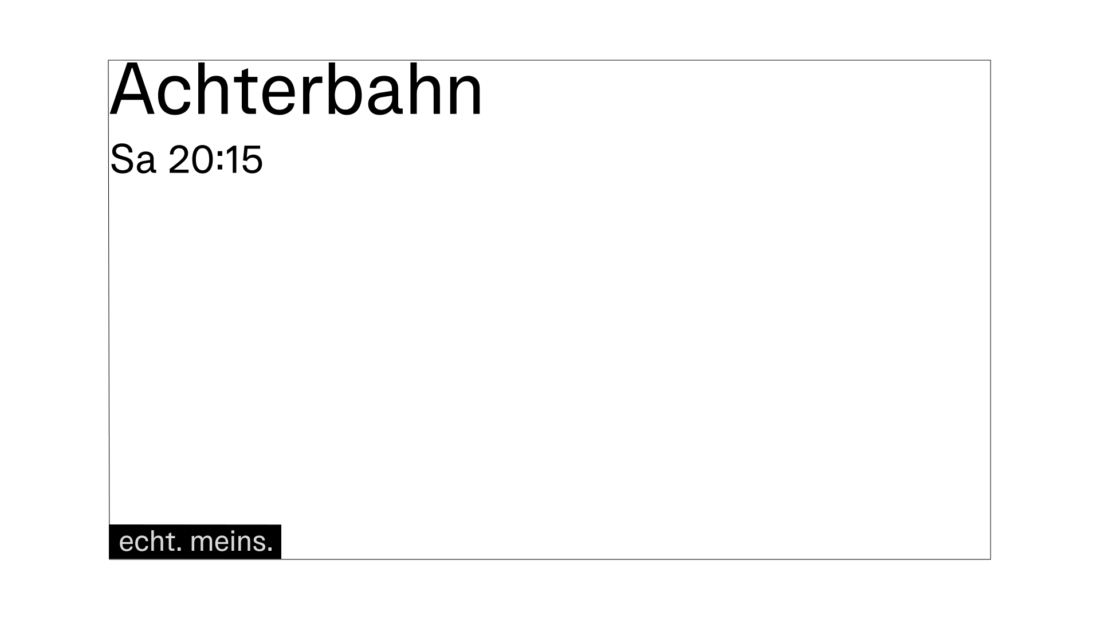
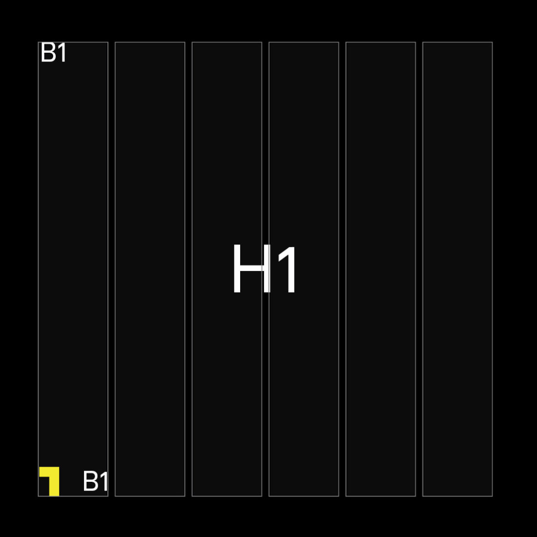
Versatility through a vivid colour concept
Previously, ORF1 struggled to unify their versatile program under one visual roof. One of the main goals of the redesign was to give better orientation to the audience within the TV program.
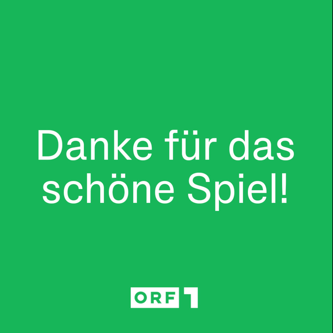
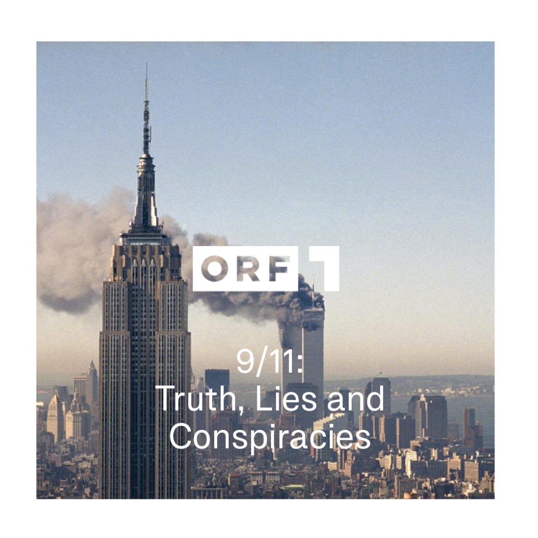
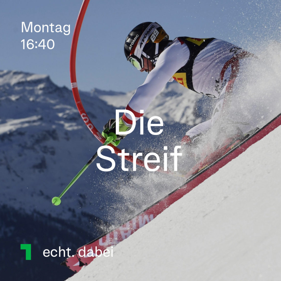
The new colour concept supported the program structure and was developed in close cooperation with ORF1. Each colour represents one thematic focus and will be used throughout the whole identity as a subtle orientation system. Additionally, each category is also associated with a respective claim. The flexibility of the colour scheme helps ORF1 to maintain a wholistic identity while being able to evolve in different directions.

The simple but original new logo animation is contemporary with no 3D showmanship. It opens up a variety of key and layer variations for a homogenous audience flow. New colour codes structure the program, they signal lightness and vitality without appearing cheap. The new design package is refreshingly different.
— Michael Hajek, Art Director @ORF
Motion design
The on-air design is inspired by common screen interaction and motion flow on media devices. The upwards scroll is one of the key elements. It adds a contemporary look and feels to the experience. It is used for transitions, type appearance and logo animations and stands for the channels open and positive spirit.
For a fresh and clean look, we also work with whitespace. This allows the colours and the brand visual to stand out. The new motion principles are followed on all dynamic content.
The layout of the ORF1 main screens: navigation, packshots, special trailer, credits, station-id.
Sample of the animations from a trailer.
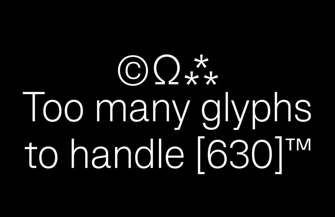
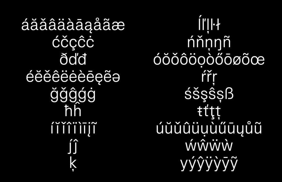
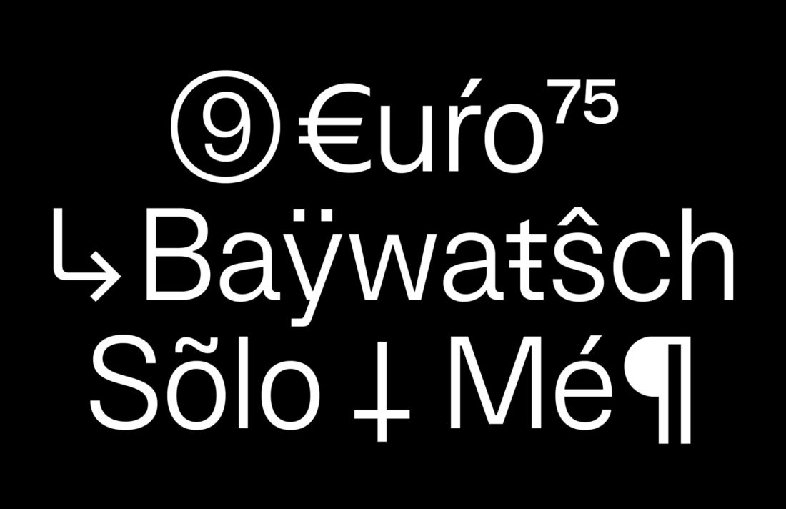
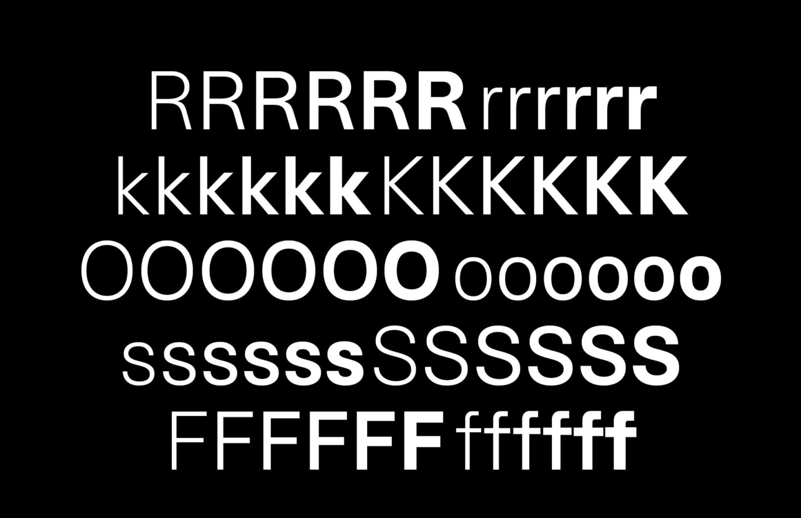
Bespoke typeface — Eins Sans
The bespoke typeface Eins Sans completes our clarity approach to the identity. It is designed to accustom every need of the channels applications and adapt to all sizes and screens. With its special detailing the typeface offers maximum readability while adding extra character to the voice of the channel.
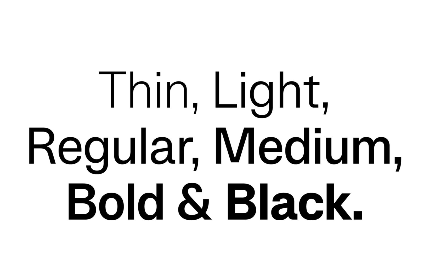
Eins Sans weight overview
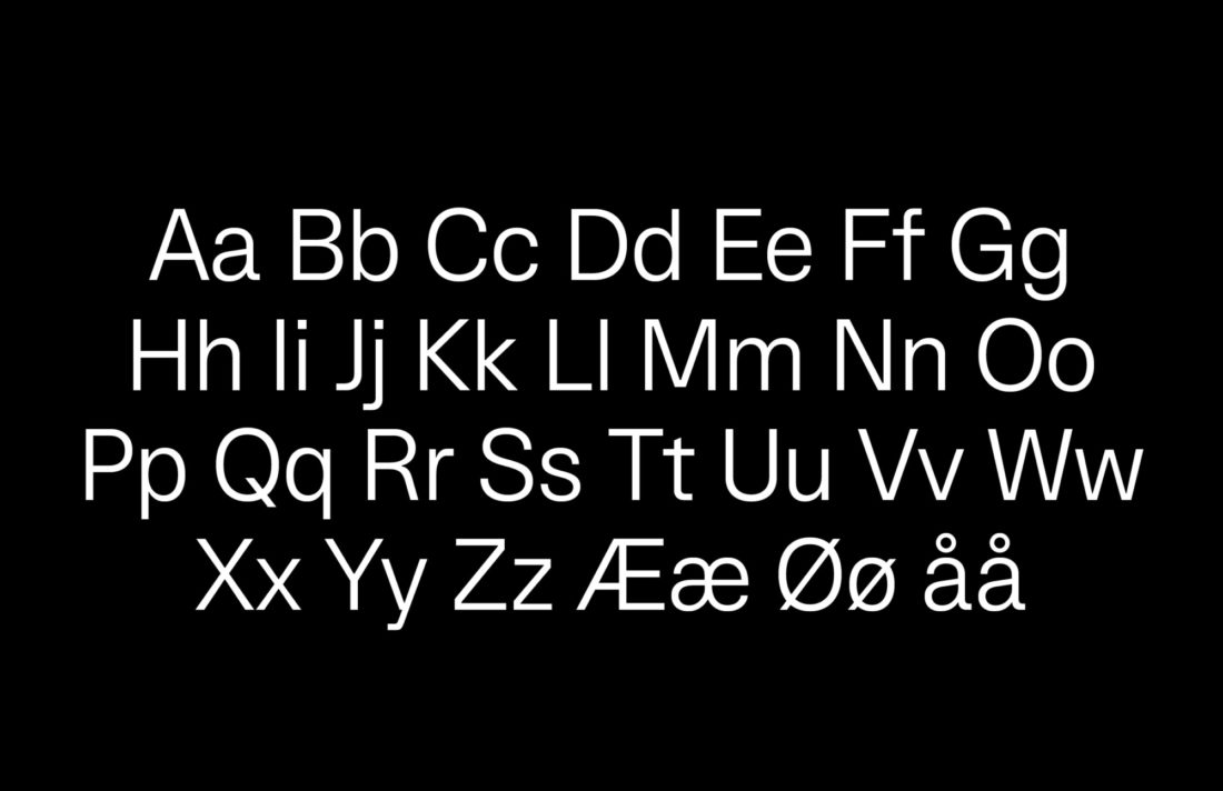
Typographic details
Eins Sans gathers inspiration and personality from the iconic 1. All terminals and curvature are squared out, horizontal strokes are made wider and it has characteristic ink blocks in all joints. The ink blocks are used to increase legibility in small sizes and create personality in display applications, a dynamic trait that changes in drama throughout the weights.
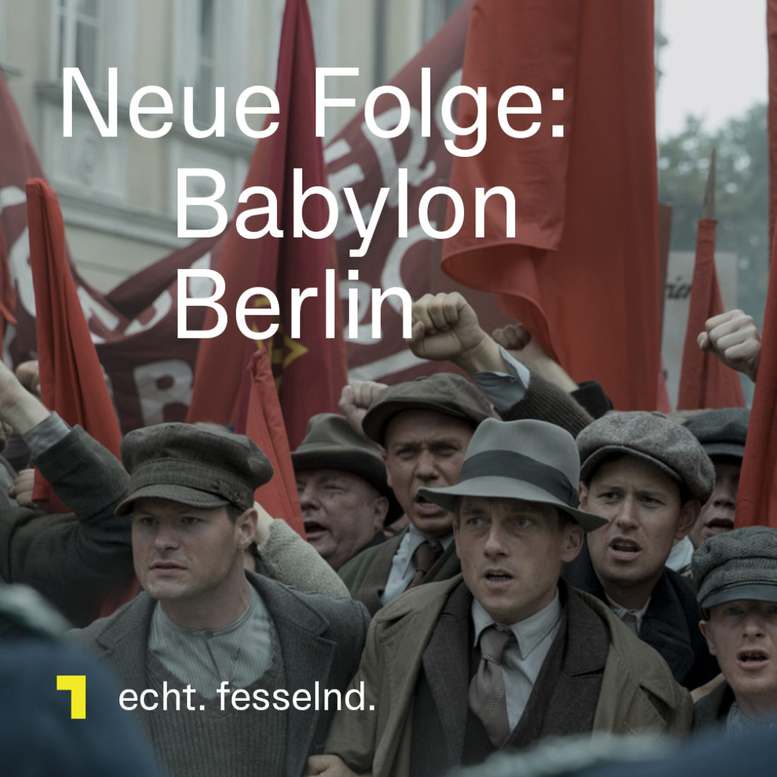
Social media
All modern broadcasters need to control their content across all media browsers. The social media principles designed for ORF1 utilise their content to create engaging storytelling and strengthen their brand.
The motion principles are applied across media.
Result
Clarity is critical when it comes to communicating information to a broad audience. Based on this principle, all elements appear clean and harmonic on its own as well as in combination with the channels content. The new design of ORF 1 not only visually forms the new brace of the full program, but it also provides the viewers with a better orientation within the program and thus emphasises the reliability of the program. In combination with an elaborate grid and layout system, the elements work with the channels diverse content while speaking unmistakably in the voice of ORF1.